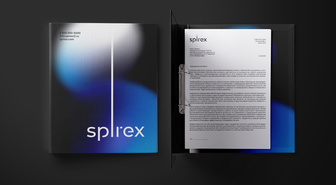
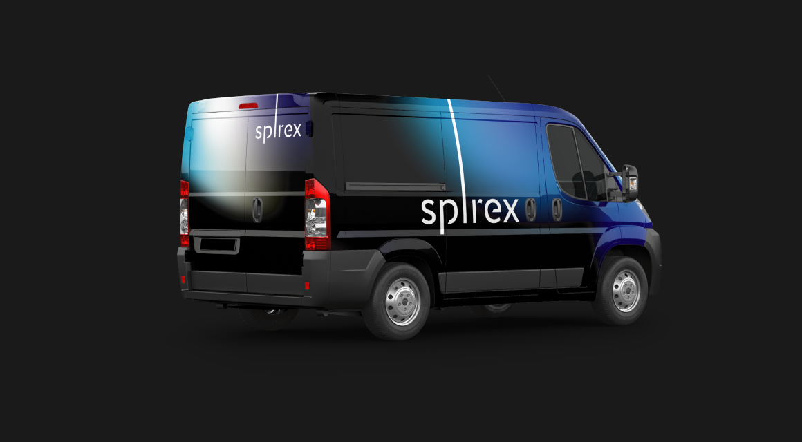
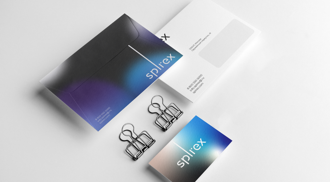
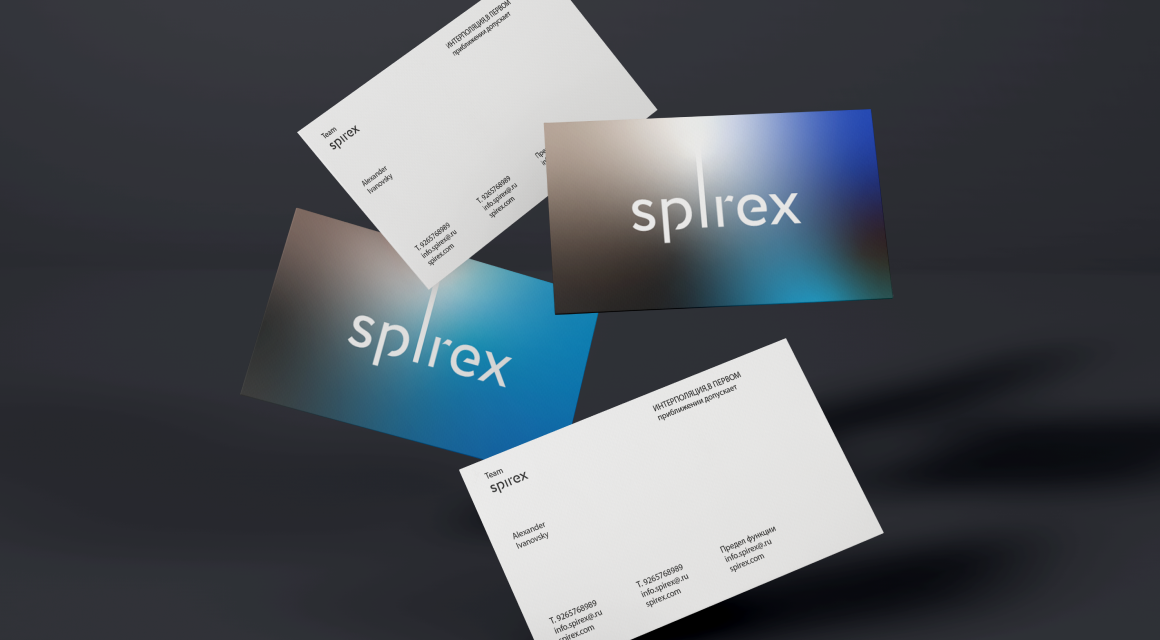
Spirex
- ClientSpirex
- DeliverablesBranding, Naming
Goal
To create a brand for the telecom infrastructure company, that builds and operates thousands of telecom towers in Russia having an ambition to expand to foreign markets.
Idea
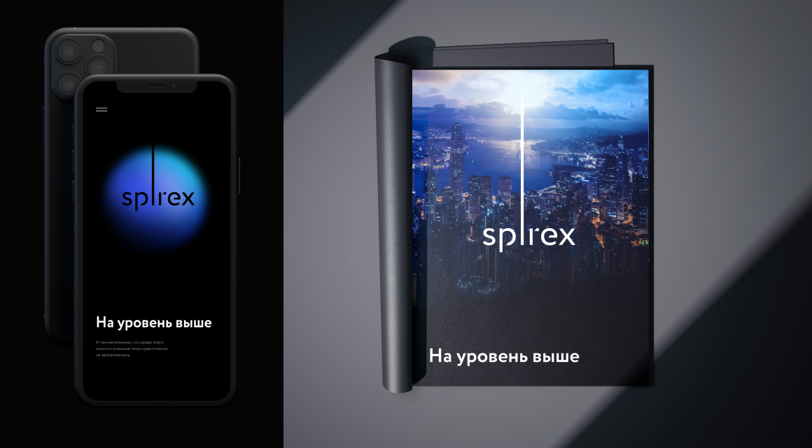
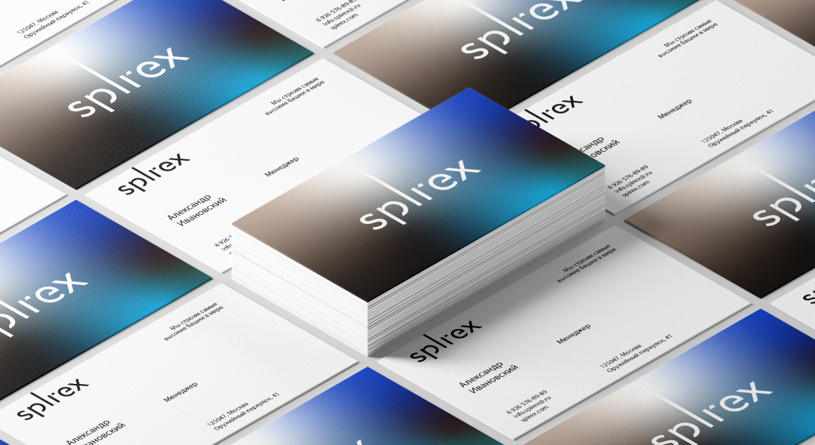
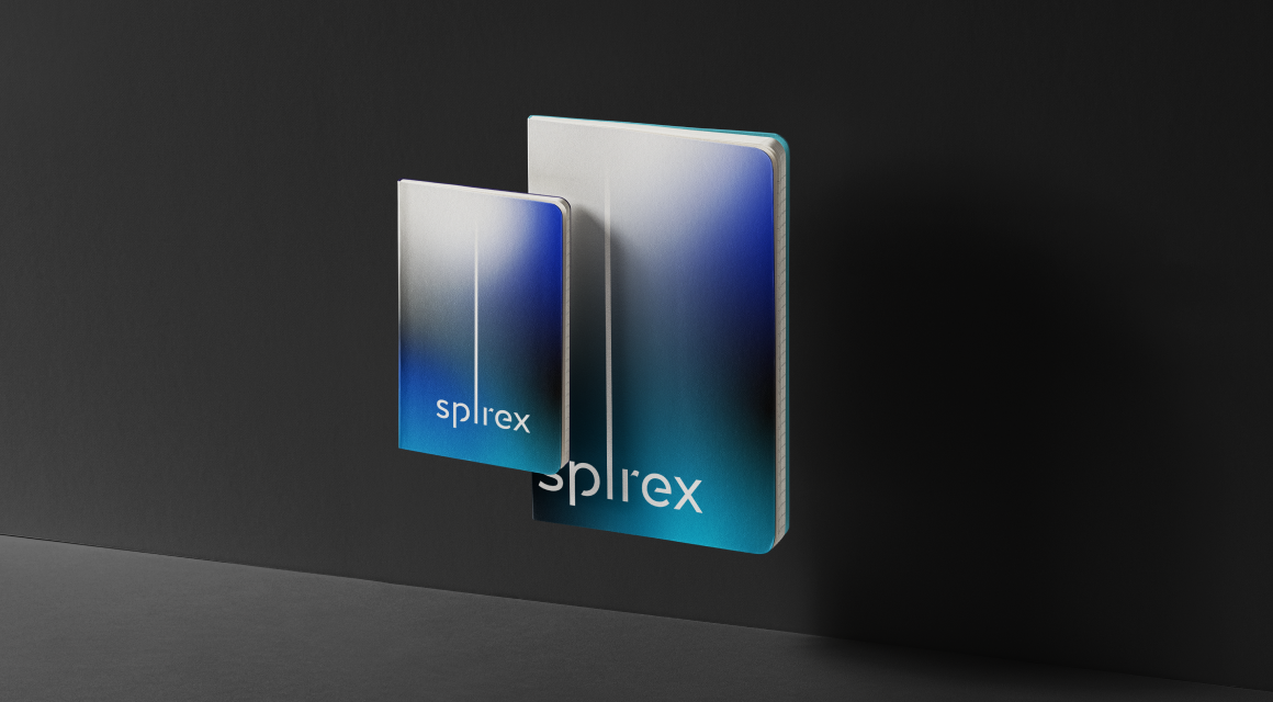
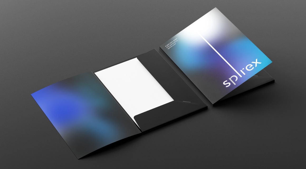
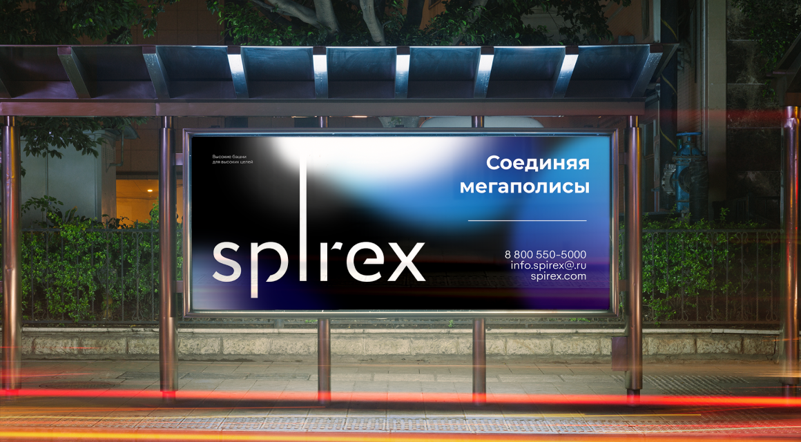
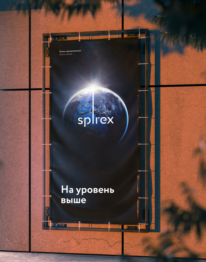
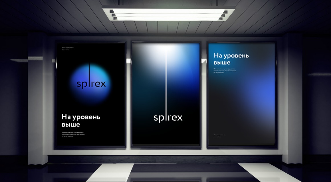
Coming up with the name we decided to couple the idea of expansion with a spire as a symbol of a telecom tower. This combination resulted in masculine sounding SPIREX brand name. This idea was then taken even further in the graphic branding where we took the «i» letter and made it into a spire or a beam of light that always goes as high as it can, limited only by the boundaries of a medium. This represents the expansion and the out-of-the-box thinking and solutions the company offers. Spirex — a level beyond.
Brandbook