Moscow Sport Interiors
- ClientMoscow city department
- DeliverablesBranding
Mission
To turn Moscow into a city in which the majority of residents are systematically engaged in wellbeing and sports.
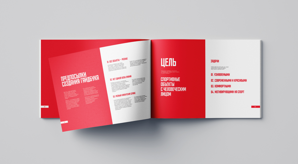
Goal
To create a new, friendly image of sports facilities in Moscow.
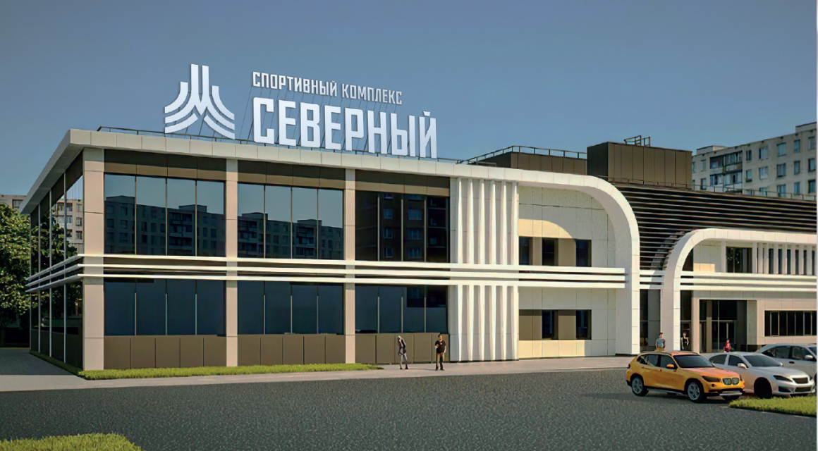
There are more than 300 sports facilities in Moscow. At the start of the project, each of them looked different, many of them had outdated interiors, an outdated and chaotic approach to service, visual style and communication. Most objects lacked navigation. These problems are a serious barrier to the popularization of sports in Moscow. The Moscow City Sports Department approached us, since we were the authors of the Moscow Sport brand, with the task of developing a guidebook for sports facilities that would solve a number of issues and help create a new understandable and friendly image.
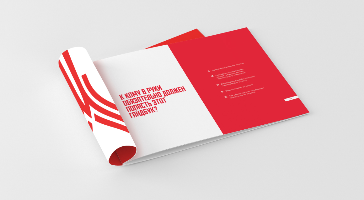
All key types of objects were thoroughly analyzed, many scenarios of visitor behavior were studied and all existing problems were identified. As a result, a list of tasks was compiled that the guidebook will help to solve. They formed the basis of the first chapter, written in an easy to understand fashion for the all key people - planners, interior designers, managers and renovation contractors.
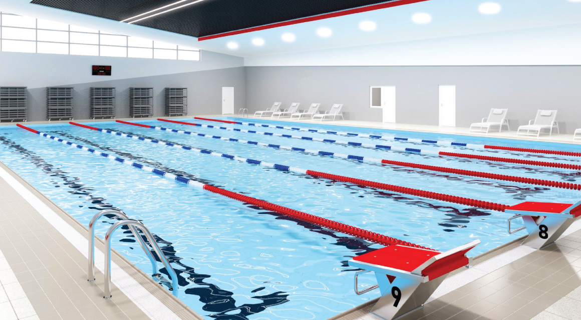
Interiors
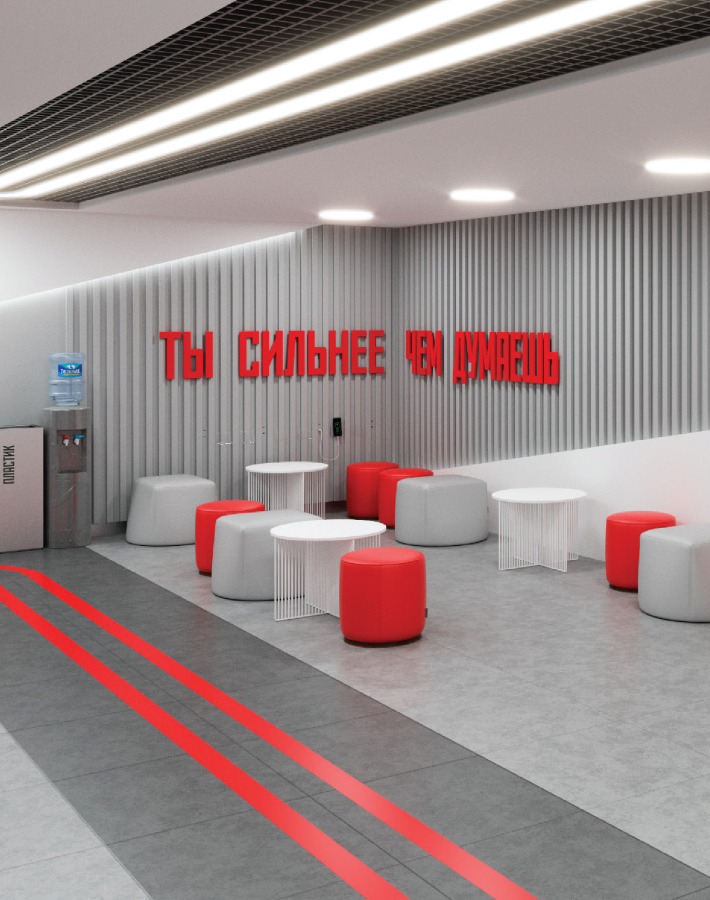
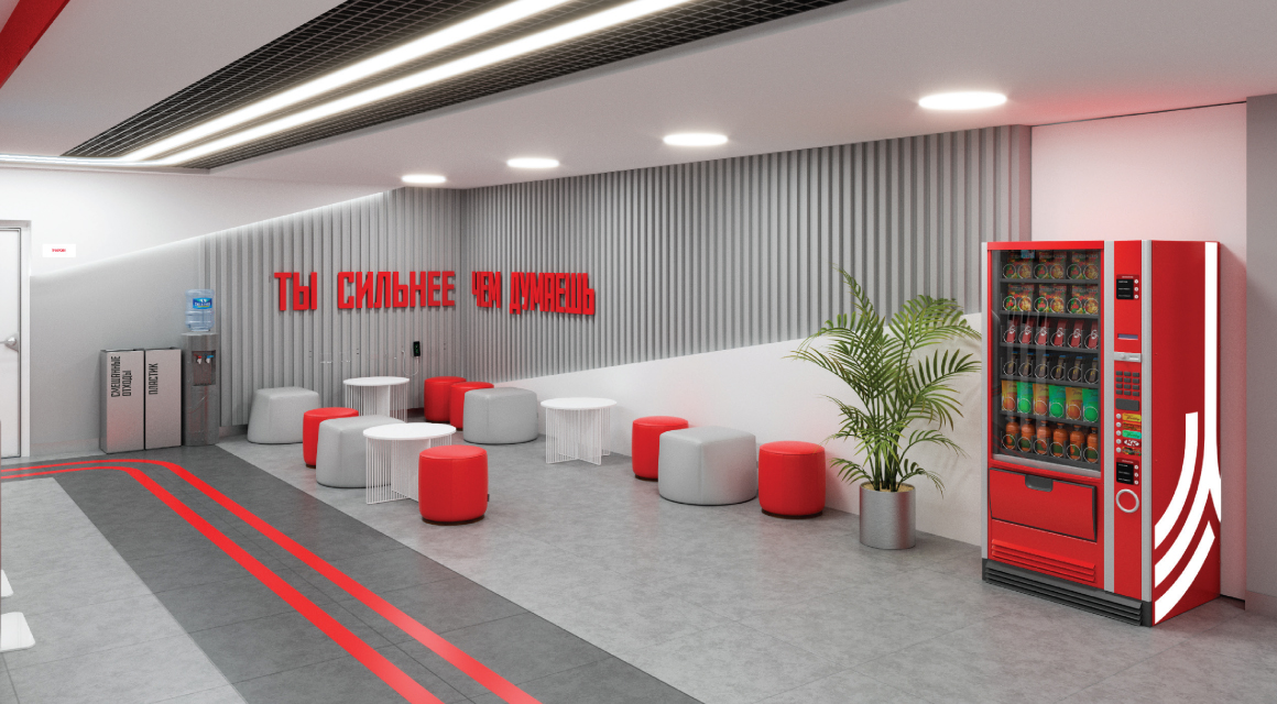
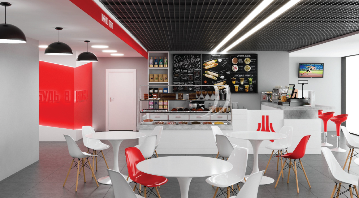
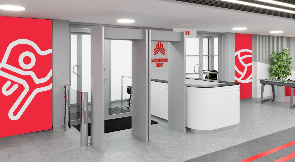
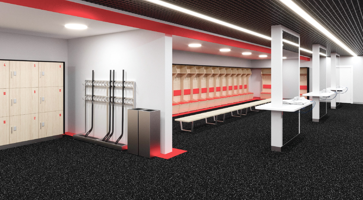
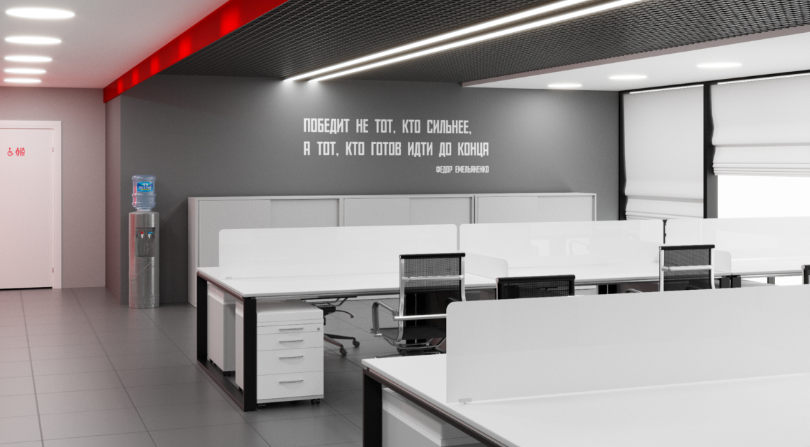
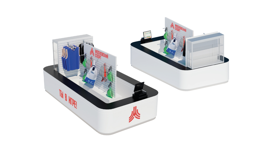
The concept of interiors develops the ideas of the logo and corporate identity of Moscow Sport: stripes symbolizing sports tracks and the path to success in sports are taken as a basis. The stripes, as guides, lead a person along the object, repeating each other on the floor in the form of lines made of wear-resistant material and on the ceiling in the form of lamps.
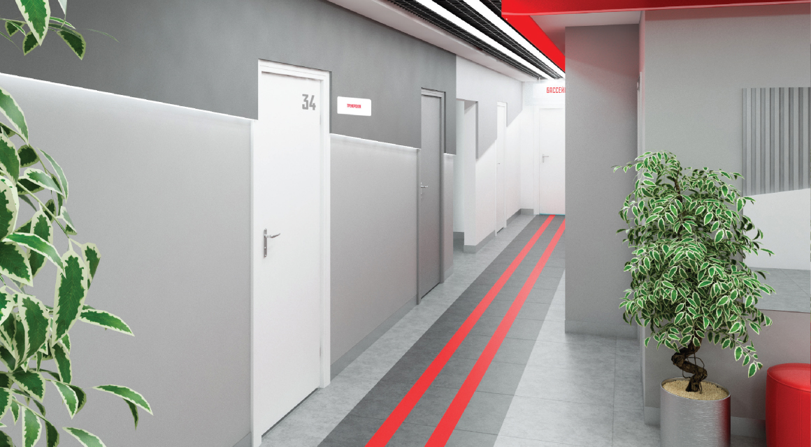
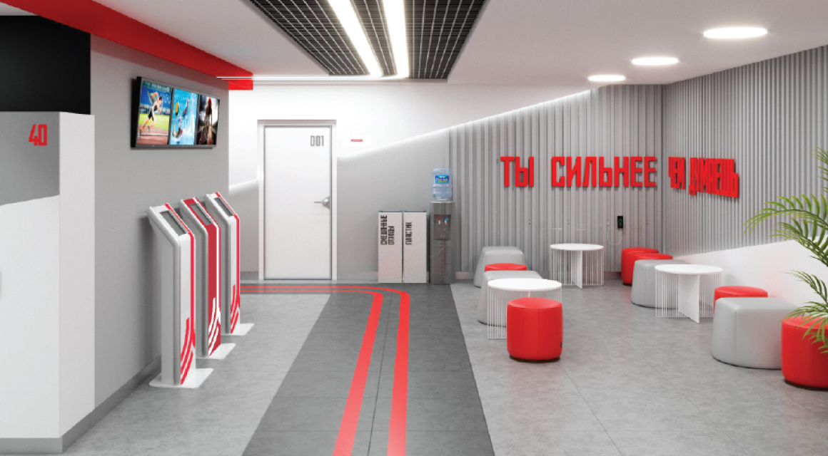
The visual style of the interiors is imbued with a sporty spirit and energy of movement, this is achieved through bright accents, emphasized rhythm, large graphics and materials.
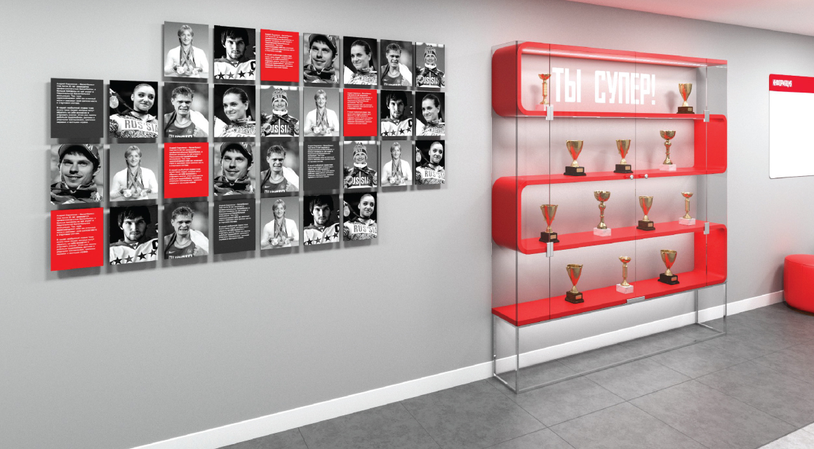
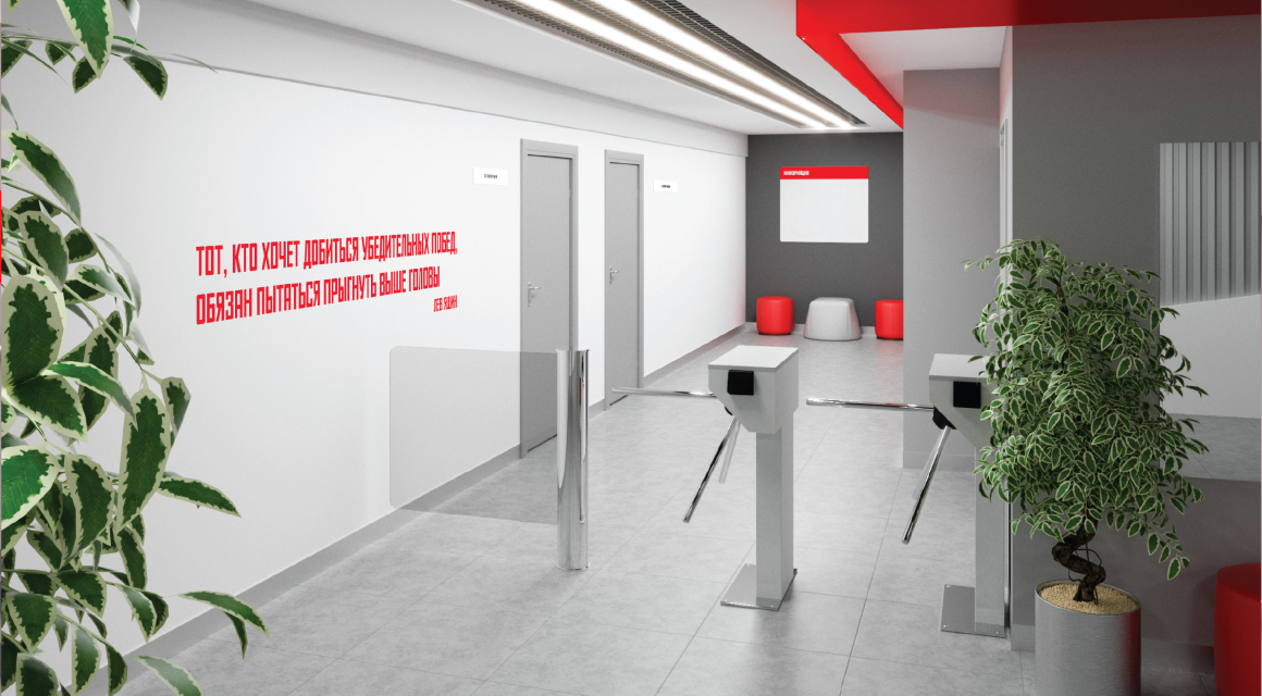
Quotes from great athletes also energize and motivate people to exercise.
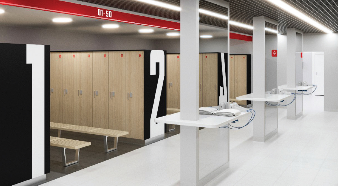
Versatility
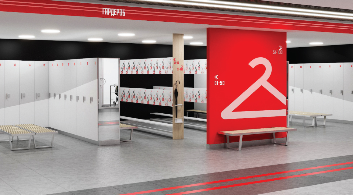
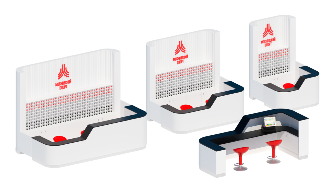
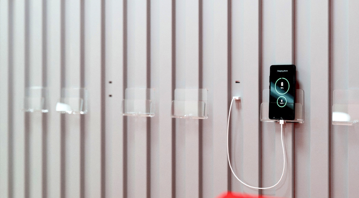
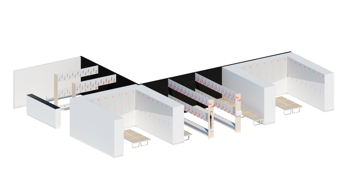
There are many sports facilities, they’re all a different size, so it was important for us to create a universal, scalable design for important interior objects, such as the reception and wardrobe, as well as take into account solutions that increase the comfort of visitors.
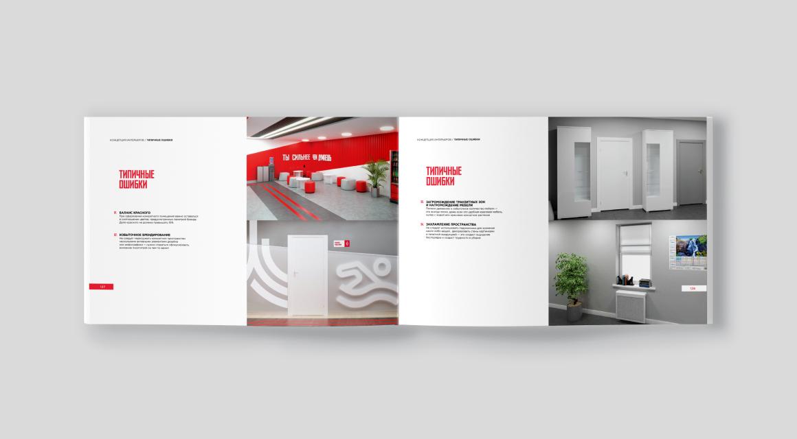
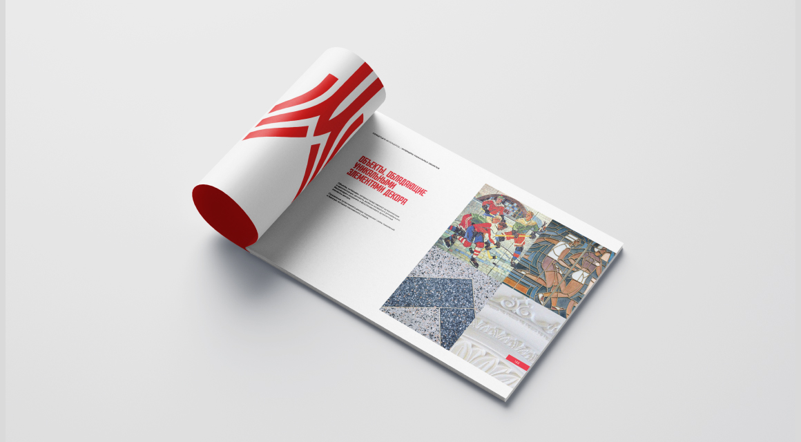
Special attention is paid to common design mistakes, the principles of creating an accessible environment, as well as the peculiarities of working with objects of historical value.
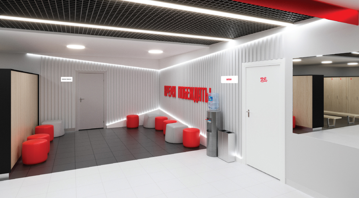
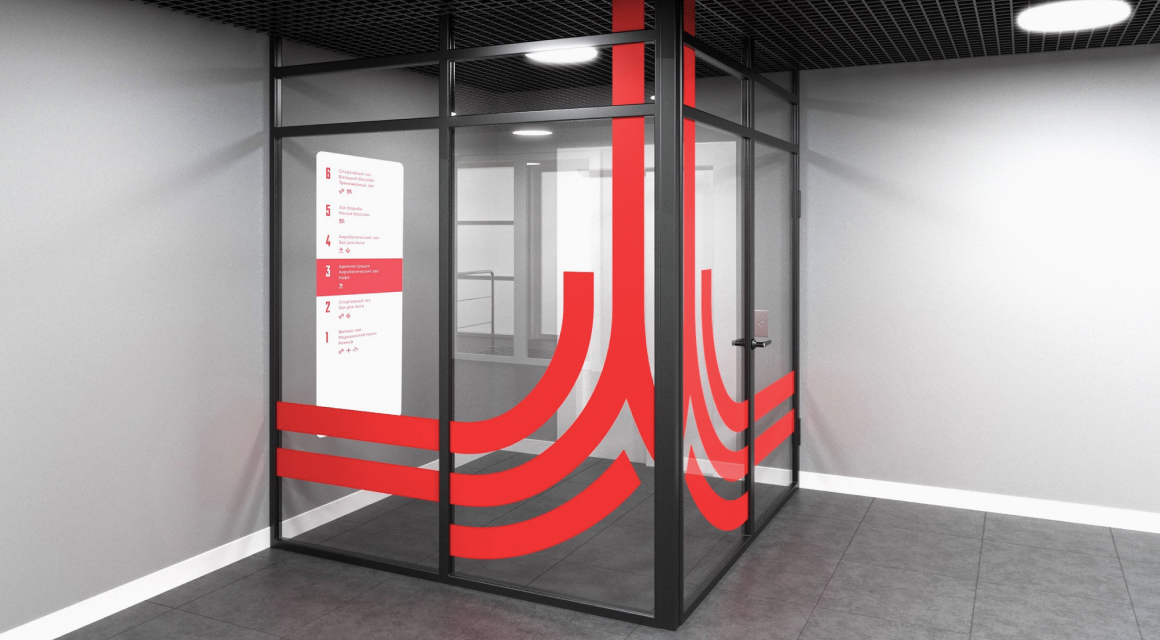
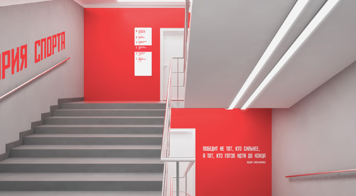
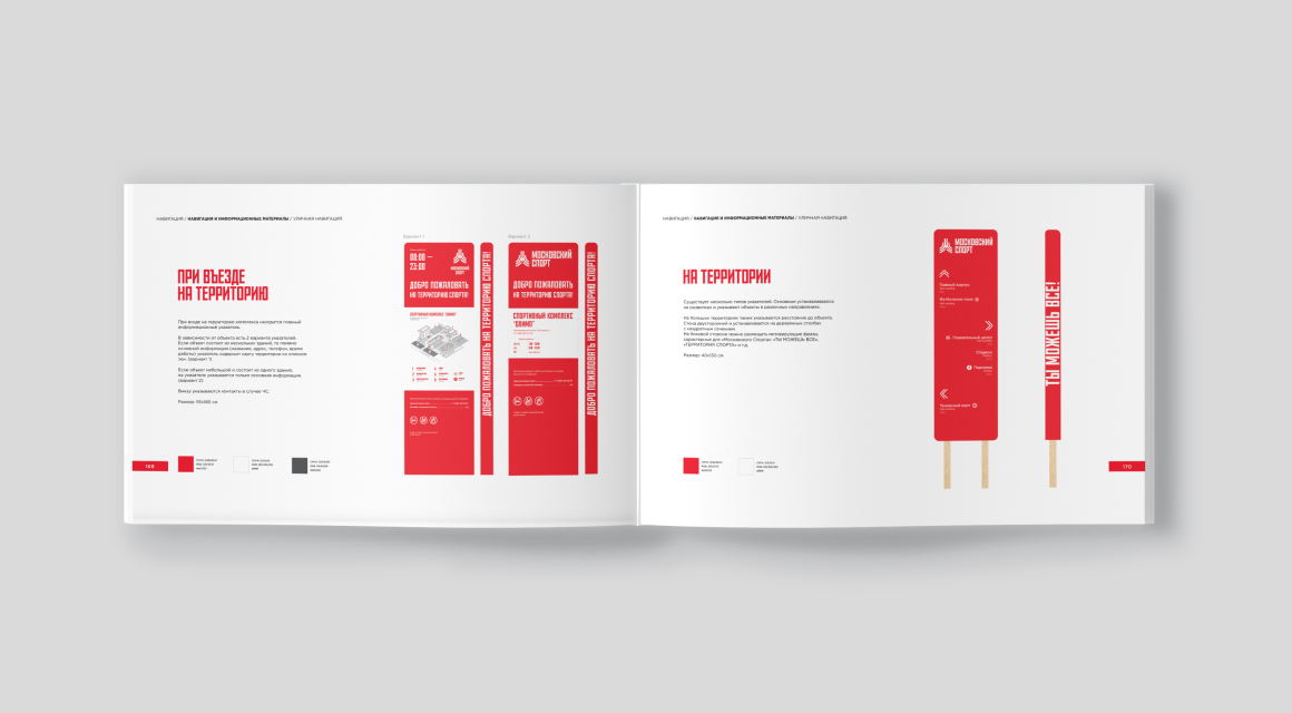
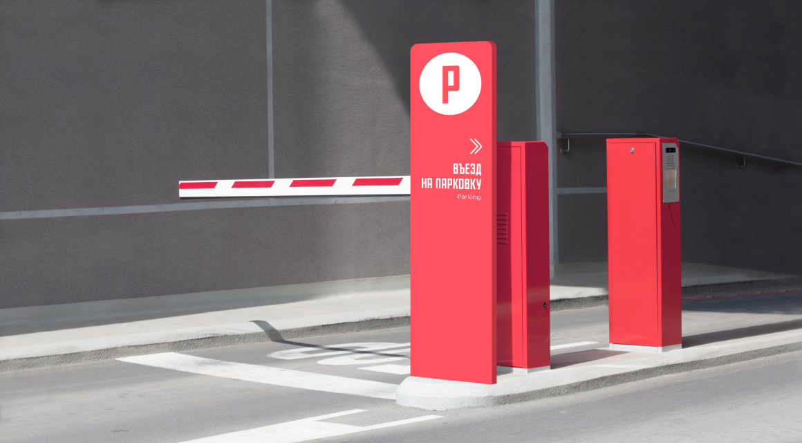
Navigation
Navigation rules were created based on typical user scenarios. The necessary templates were developed and the principles of using and placing each of them were spelled out. These templates make it easier for designers to design and plan navigation for each specific object.
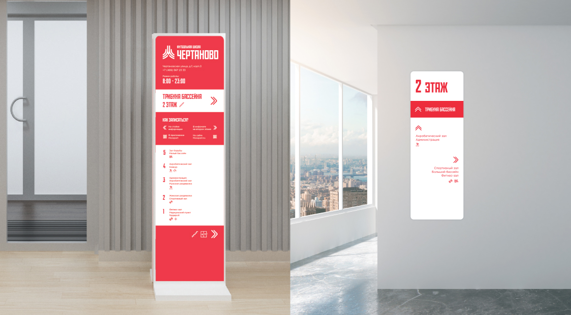
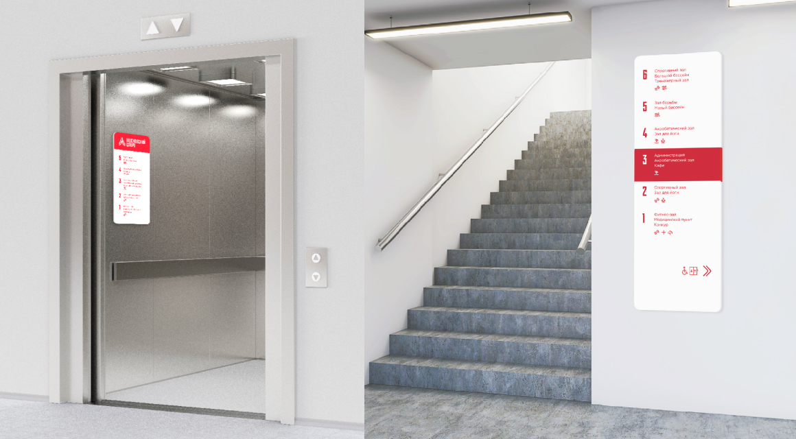
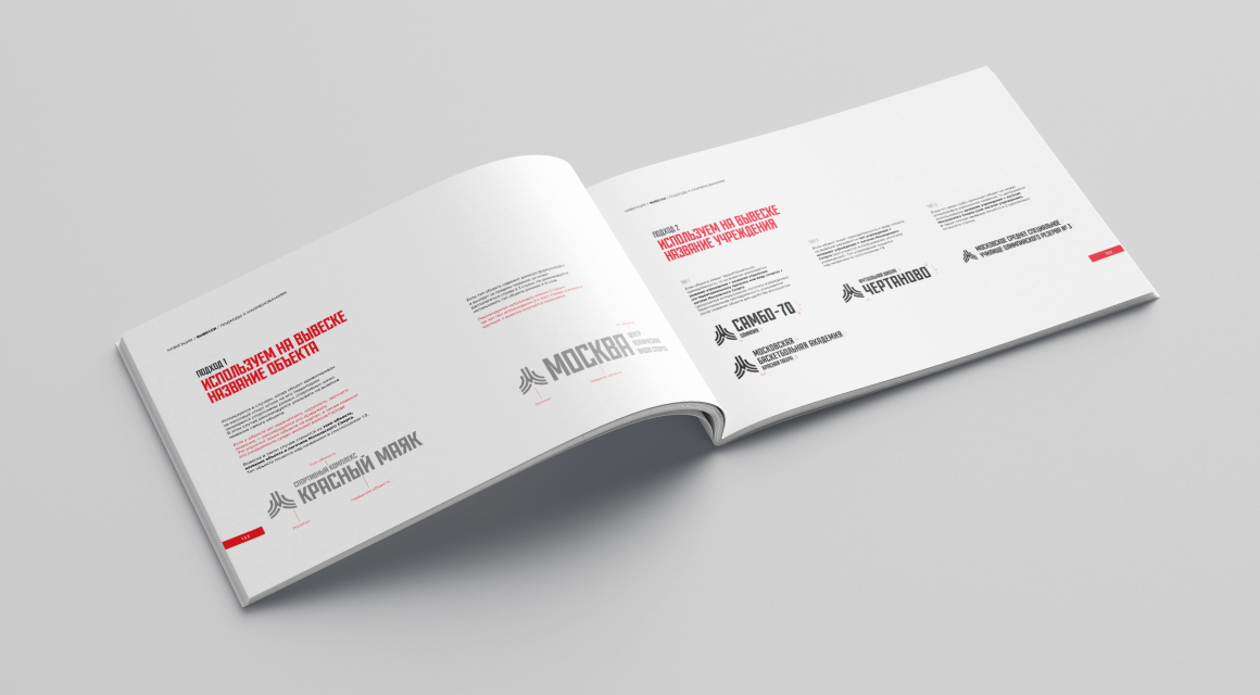
The rules for composing signs for different cases and types of institutions are now unified.
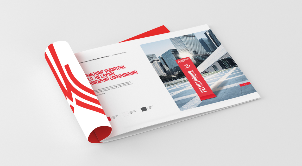
The navigation uses a unique, custom Mossport font and branded stripes that emphasize the connection with the brand.
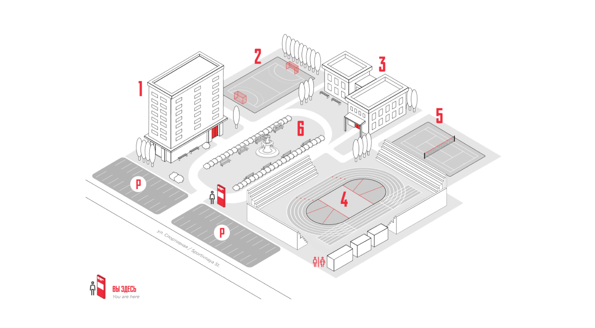


Temporary pointers provide easy navigation for large events.
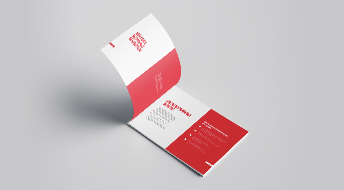
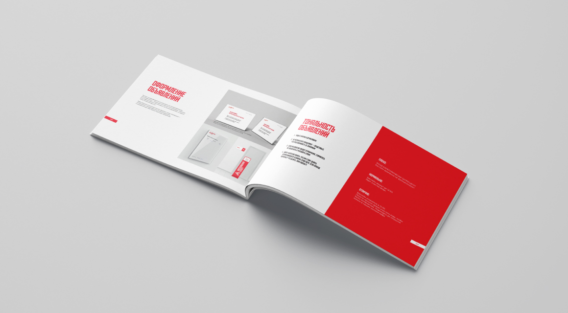
Communication
One of the significant sections of the guidebook is the new tone and rules of communication at the facility.
To be continued….
A guidebook is a living organism. He will have to change and replenish over time. And at this moment it is already being actively used in practice and creates a new friendly and recognizable face of Moscow sports facilities.